Artwork
Creating the Ghostface Killah/Wu-Tang Ice Cream Logo
On 24, Feb 2013 | 3 Comments | In Artwork, Client, Design, Thoughts | By aw177
An insight into the thought process and creation of the Ghostface Killah/Wu-Tang Ice Cream logo, including sketches and rejected designs.
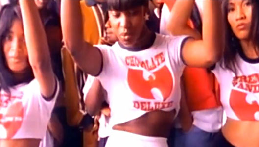
 Thought it might be interesting if I shared how I came about creating the Ghostface Killah/Wu-Tang Ice Cream logo. Ghost’s people wanted an update to the ice cream logo that can be put onto t-shirts for his merchandise line (Official Ghostface Killah Merchandise). The original logo can be seen in the “Ice Cream” video:
(If you want to watch the video, all you gotta do is go to YouTube and search “Wu-Tang Ice Cream”).
To me, the original logo was very simple, just the Wu-Tang “W” logo with the flavors in text. That’s it. Not much more to it. At first, I thought to try something different with the “ice cream” thought in mind – maybe an ice cream cone with the flavors in different colors? Maybe use the Ghostface Killah hockey mask in the cone and put the ice cream on top of it? The song also had a lyric by Method Man that said “with the cherry on top”, so maybe an ice cream cone w/ a cherry on top?
When I begin to do a logo/design piece, I usually try to sketch it out first to see how it looks like before I begin to vector it up. So taking my sketchpad and a simple mechanical pencil, I sketched up this simple design (click image to make it larger):
The circle with the eyes/mouth and Wu-Tang logo is based on the mask Ghost wears in one of his promotional pictures:
The swirl of ice cream on top would be in different colors to signify the flavors recited in the song: French Vanilla, Butter Pecan, Chocolate Deluxe and Caramel Sundae. A cherry would go on the top (this would also represent something else, but I’ll let you figure that on your own).
However, I didn’t really like the Ghost mask in the logo and Ghost himself told me that he didn’t want to incorporate the mask into his designs anymore, so I decided to take it out. It didn’t really go with the ice cream design anyway; but I like how it looked so far, so decided to do a quick vector of it to see how it would look like.
Anything I do at this point would not guarantee me that it would be used, so to do something too detailed wouldn’t make sense, but to do something too simple would not look good – you need to find a balance between what is simple and too much. I would have to let Ghost’s people look at this and let them decide if they want to use it or not, so it needs to be ‘enough’ for now.
My first initial vector designs of two flavors, Butter Pecan and Chocolate Deluxe in ice cream form (click image to make it larger):
Not bad, how would it look without the outlines?
I like these designs, it’s different and think it would look cool on a t-shirt. I also wanted to give the client something familiar to the old logo but with and updated design. So for another submission, I tried to do something similar to the old logo – I sketched out this design (click image to make it larger):
The elements here are the same as the initial ice cream cone designs – the “W” Wu-Tang logo is the cone, the flavor ice cream is dripping on top of it with a cherry on top. To top it off I added a banner across it with the flavors in different fonts. Simple but effective.
The first initial vector design was the French Vanilla one – thought it would be cool to add the flag of France into the banner (click image to make it larger):
And one without the flag:
I really liked these two designs, so I decided to submit them for review first before I go about creating more in case they don’t like them. I received a positive confirmation for the second design (French Vanilla) and created more for the other flavors. The client also wanted a new one for my Asian women, Asian Persuasion (I know it’s not a ‘flavor’ but that’s what they wanted). You can see all the flavor designs here: Ghostface Killah/Wu-Tang Ice Cream Logo
Contract signed, high-res logos submitted and uploaded, and a few weeks later, it’s officially in Ghostface Killah’s IndieMerch store:
Definitely one of the greatest highlights of my art/design career, to do something for one of the top MC’s in one of the best hip-hop groups of all time. It’s probably the first time I’ve been starstruck to chat with Ghost online as well. I’ve been listening to Wu-Tang since ’92 all the way to this day. Can’t give enough props and respects to Ghostface Killah and his people for giving me this chance and opportunity.
A future blog post and featured project on my site will include other designs that were either considered for use, cut, rejected or never mentioned. Hope you enjoyed this blog post and that it gave you an insight to my design process and help those who are new to the design game.
-
This is both steret smart and intelligent.
-
Where can I get a WU ice cream shirt that says caramel sundae ?
Submit a Comment


Comments